Decorating is amongst the most exciting things you can do with your home, especially after buying your first. Having the chance to truly make your mark, and make your home your own, is a beautiful thing – even if you are struggling for ideas. The best place to start, and perhaps the most confusing, is with colour. Colour theory can be a helpful way to envisage your future home’s interior design, but how?
Colour theory is by no means a simple subject. That’s something well-demonstrated by the runaway popularity of such divisive brain-scratching memes as ‘The Dress’. For the uninformed, ‘The Dress’ was a picture of a dress that became the source of weeks of heated online debate, appearing as if it did to be either white and gold or blue and black to different people.
Basic Colour Theory
FOr sure, there are endless avenues of colour psychology and pseudo-colour to get lost i. But there are also some basics that can be extremely useful in taking responsibility for your luxury interior design. For example, understanding the basic terms for colour and contrast can give you a better vocabulary for finding the right palettes.

To start with the very basics, there are three echelons of colour: primary, secondary, and tertiary. The primary colours are base colours, being red, yellow and blue. Secondary colours are created from mixing primary colours, and tertiary created from mixing secondary and primary colours together.

Building a usable colour palette for your space involves understanding which colours from these echelons work well together. This is already getting a little involved, but thankfully there are tools available to make the job easier for the non-graphic designers amongst us. Using a colour wheel allows us to find compatible colours for a palette with ease.
Hues and Tone
Understanding the colour wheel means understanding exactly what we mean by terms like hue, tint, tone, and shade. Hue means a pure colour, as created from the colour echelons shown above.

Tint refers to a hue with any amount of white added to it, while tone means the same but for grey. Lastly, shade covers hues with black added to them.
Understanding Temperature
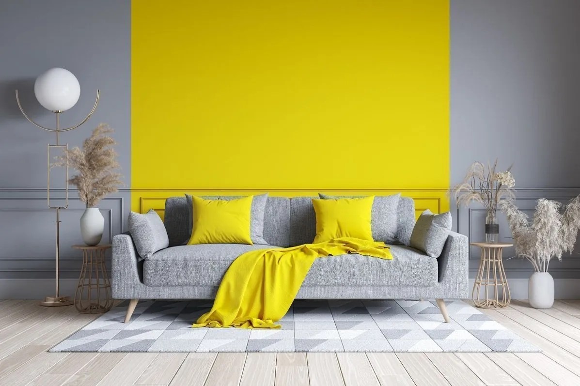
But what does all this mean for your interior design plans? Let’s get practical, and break down the most useful way of looking at colour and palettes – temperature. There are warm and cold colours, dictated largely by wavelength; longer wavelengths like red and yellow are warmer than higher-wavelength colours like green and blue.

Using temperature as a guiding influence in your room designs can help you greatly with the feel of your home. Pairing warm-neutral wallpaper tints with lamp shades with a warm hue can help to elevate the depth of space, and create a comfortable environment with a hint of comfort to it. Cold colours might seem undesirable but can indicate freshness and coolness – making them perfect for bathrooms and sleeping spaces.